Brand identity · PrintOne identity applied across residences, print and signage.
A group selling premium residences in Tangier needed an identity that carried the same weight as the buildings it was putting its name on.
- Client
- Estrella Holding
- Sector
- Real estate · Investment group
- Year
- 2025
- Duration
- 6 weeks
- Branding & Design
- Brand guidelines
- Print & marketing material
A premium offer, presented like a generic one
Estrella Holding develops and sells residential projects — Résidence Moussa and Place Mouzzart in Tangier, plus a project in Tétouan. The product was premium, the buyers were serious, and the price point reflected both.
What the buyer saw first did not. Each residence had been presented with its own improvised layout, its own colours and a logo that changed slightly every time it was placed on something. There was no shared system, so nothing that was produced made the next thing easier to produce.
No single source file for the logo, so every application redrew it
Colours and typefaces chosen fresh for each residence
Nothing written down — every decision had to be re-explained
Marketing material for each project looked like a different company
One architectural system, applied everywhere
We treated the identity the way the group treats a building: a structure decided once, then applied with discipline across every project it signs.
Positioning before drawing
We sat down with the group to define who buys these residences, what they compare them against, and what the brand has to signal in the first two seconds. All of it written before anything visual existed.
A monogram, not a decoration
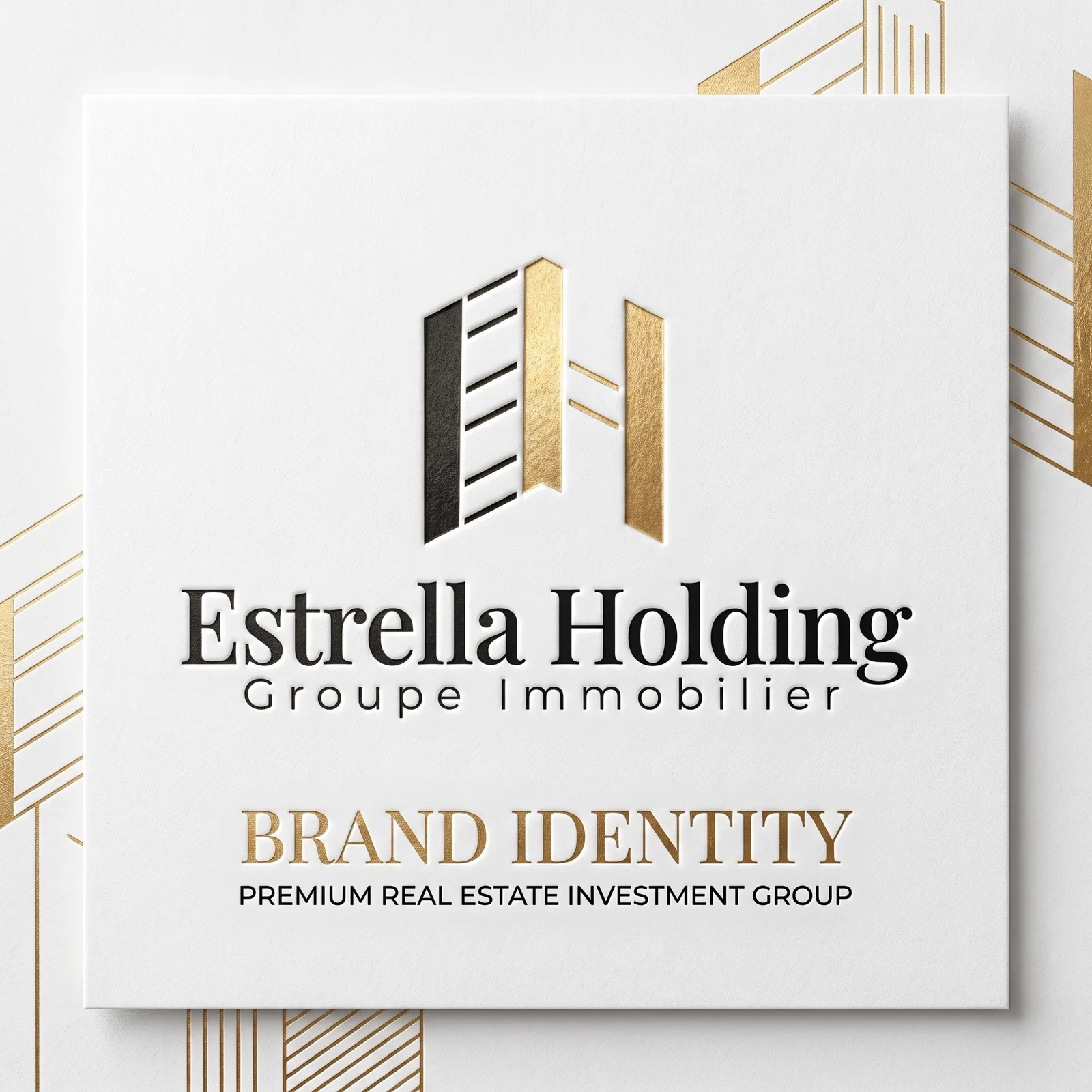
We built the mark around an architectural monogram in gold on black — a shape that survives being engraved, embossed, printed small on a card and enlarged on a hoarding.
Palette, typography, rules
We fixed the gold-and-black palette with exact values, paired the typefaces with a real hierarchy, and wrote the spacing and usage rules into a brand book so the system holds without us in the room.
Apply it to real projects
We produced the stationery and the marketing visuals for the Tangier residences and the Tétouan project, so the system was proven on live material rather than on mockups alone.
What we delivered
A complete identity, written down, and already applied to the group’s live projects.
Identity core
- Architectural monogram logo in gold on black, with light and single-colour versions
- Full colour palette with exact print and screen values
- Typography pairing with a defined hierarchy
- Written brand guidelines covering logo use, spacing and misuse
Applications
- Stationery set — letterhead, envelope, business cards, folder
- Marketing visuals for Résidence Moussa and Place Mouzzart, Tangier
- Marketing visuals for the Tétouan project
- Branding scenes for use in sales presentations and social posts
Handover
- Source files in vector, plus export-ready formats
- Guidelines delivered as a document the team can hand to any supplier
- Editable layouts so future residences reuse the same structure
What itactually looks like.
Brand identity — cover
⚠️ Placeholder image
What changed,measured.
1
written brand book
Logo use, colours, typography and spacing rules in a single document
3
projects given marketing material
Résidence Moussa and Place Mouzzart in Tangier, plus the Tétouan project
Print + signage
identity applied across
Stationery, sales material and project visuals all run on the same system
- Any printer or supplier can now be handed the guidelines and produce something on brand.
- A new residence starts from an existing layout system instead of a blank page.
- The monogram works at every size the group needs, from a business card to a hoarding.
The brief was not a logo. It was a system solid enough that every future residence would still look like the same group ten projects from now.