Brand identity · WebsiteAn established engineering firm, presented like one.
An engineering company with years of serious industrial and telecom work behind it was still presenting itself with material assembled a decade ago.
- Client
- IngTelma
- Sector
- Industrial engineering · Telecom
- Year
- 2024
- Duration
- 6 weeks
- Branding & Design
- Brand guidelines
- Websites
The track record was ahead of the presentation
IngTelma is established. The projects, the technical capability and the client list were never the problem — the problem was that none of it was visible to anyone who had not already worked with them.
The identity had drifted over the years: several logo variants in circulation, no fixed colours, documents produced in whatever template was on the machine that day. For a company bidding on industrial and telecom work, that gap between capability and presentation costs credibility in the first minute of a meeting.
Several logo variants in use, none of them the master file
No colour or typography standard across proposals and documents
Corporate documents built ad hoc, one machine at a time
No website able to carry the company’s actual references
Refresh the mark, then make it hold
This was not a company that needed reinvention. It needed its existing equity tightened, written down, and put somewhere a prospect could find it.
Audit what already exists
We collected every version of the logo, every document template and every piece of signage in use, and mapped what was worth keeping against what was simply drift.
Refresh, do not replace
We rebuilt the mark cleanly — proper construction, proper spacing, proper versions — so the company stayed recognisable to existing clients while finally being technically sound.
Write the standard
Palette, typography, document layouts and signage rules were fixed in a guidelines document, so the next proposal and the next sign both come out right without a designer.
Build the corporate site
A corporate website structured around what a prospect actually needs: what the company does, in which sectors, with which references, and how to reach the right person.
What we delivered
A tightened identity, written rules, and a corporate site that carries the company’s references.
Identity system
- Refreshed logo with horizontal, stacked and single-colour versions
- Colour palette and typography with exact values
- Written guidelines covering construction, spacing and misuse
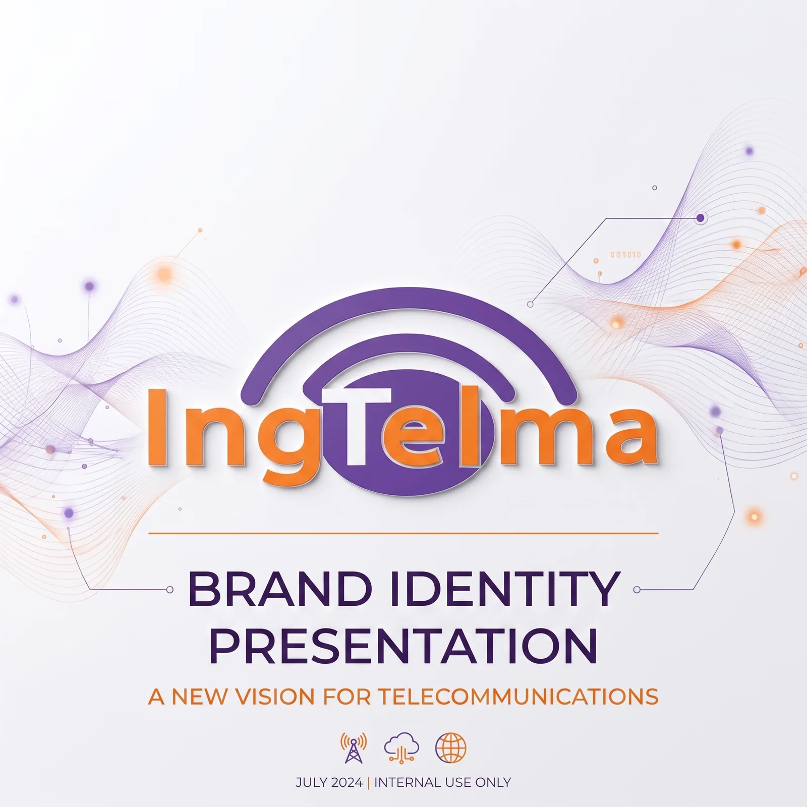
- Identity showcase for use in presentations and tenders
Corporate applications
- Stationery set — letterhead, cards, document templates
- Office reception signage produced from the new system
- Layouts for proposals and technical documents
Website
- Corporate site covering activities, sectors and references
- Contact routing to the right department
- Content editable by the team, no developer required
What itactually looks like.
Identity presentation — cover
⚠️ Placeholder image
What changed,measured.
1 master
logo file, all versions
Replacing the several variants that had been in circulation
Print + signage
identity applied across
Stationery, document templates and the office reception signage
Editable
corporate website live
The team updates references and pages without a developer
- Proposals and technical documents now leave the company looking like one firm.
- The reception signage and the website run on the same visual standard.
- A prospect who searches the company finally finds something that matches the track record.
With an established company the job is restraint. We tightened what was already theirs and wrote it down, rather than handing them a brand their own clients would not recognise.