Brand identity · WebsiteA Dakhla company with a brand book it can hand to anyone.
A company building its name in Dakhla needed one identity to carry it — on the door, on a business card, and on the first page anyone finds.
- Client
- À L’Aube de Dakhla
- Sector
- Services · Local business
- Year
- 2026
- Duration
- 5 weeks
- Branding & Design
- Brand guidelines
- Websites
A young company in a growing city
Dakhla is moving fast, and so was the company. New contacts every week, cards handed out at every meeting, and each of those cards printed from a different file with a slightly different logo on it.
Nothing had been fixed yet: no palette, no typography, no rules, no website. Every document was made from scratch, which meant every document quietly undid the last one. In a city where reputation travels by introduction, that inconsistency costs more than it looks like it does.
Logo redrawn or restyled for each new document
No colours or typefaces fixed, so nothing matched
Business cards printed from inconsistent files
No website, so a new contact had nowhere to check the company
Fix it once, then apply it
The company did not need a large system. It needed a small one, written down clearly enough that nobody has to improvise again.
Agree the positioning
We defined who the company serves in Dakhla and how it wants to be seen, and wrote it down before opening a design file.
Build the identity
Logo, palette and typography developed together and presented in context — on a card, on a document, at a reception desk — rather than on a blank square.
Write the guidelines
Usage, spacing, colours and misuse fixed in a short guidelines document, so any printer or supplier in the city can produce something correct.
Apply it and go live
We produced the stationery and business cards, applied the identity at the headquarters reception, and built the website so a new contact has somewhere to land.
What we delivered
A fixed identity, the printed material that uses it, and a site to point people to.
Identity
- Logo system with the versions needed for print and screen
- Colour palette and typography with exact values
- Written brand guidelines covering usage and misuse
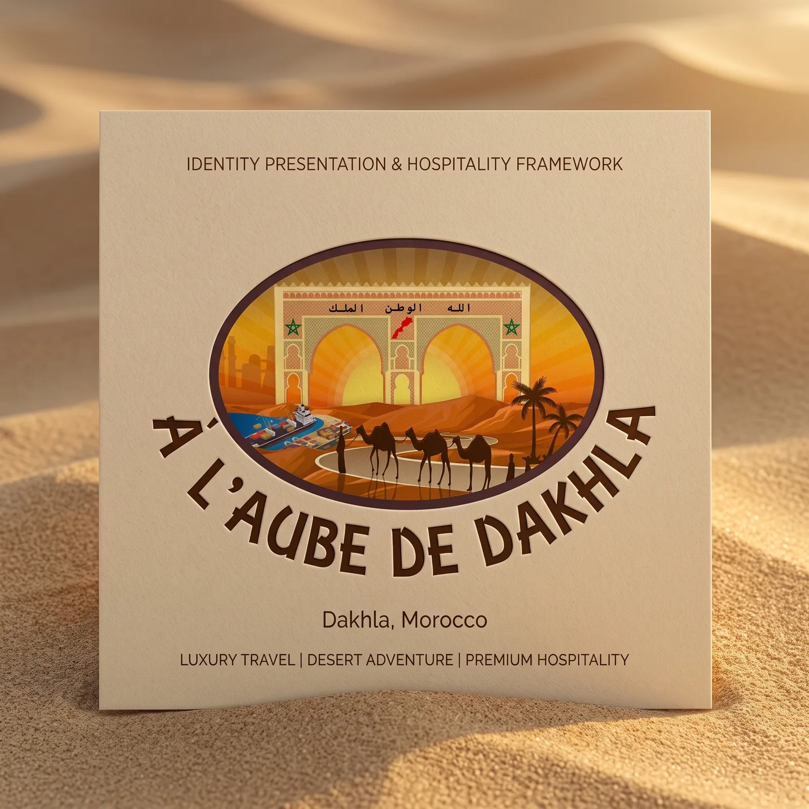
- Identity showcase for presentations
Print and space
- Stationery set — letterhead, envelope, document templates
- Business cards designed for daily use
- Identity applied at the headquarters reception
Website
- Site presenting the company, its activity and its contact details
- Mobile first, with a contact form routed to the team
- Editable by the client without a developer
What itactually looks like.
Identity presentation — cover
⚠️ Placeholder image
What changed,measured.
1
fixed identity, written down
Logo, colours, typography and rules in a single short document
Card to reception
identity applied across
Business cards, stationery and the headquarters reception
Editable
website live
The client updates content without calling a developer
- Every business card handed out now comes from the same file.
- A local printer can work from the guidelines without asking questions.
- A new contact has a website to check the company on the same day they meet it.
A young company does not need a sixty-page brand book. It needs a short one it will actually follow, and printed material that proves the system works.